How to create professional presentations
Want to create professional presentations for your online courses? In this post we will detail all the stages of the creation process, from the choice of colors and images to the correct use of fonts and spaces.

Professional presentations: how to create one for your online course
If you still do not understand the importance of good design for professional presentations, know that our brains process images 60,000 times faster than texts.
That’s one of the reasons why you should improve the visuals of your course, blog, and any other material you produce for the public.
We understand that creating your own presentation can seem daunting if you do not have any design experience, so we will share some instructions to help you craft amazing visuals and professional presentations.
These tips can be used for any visual content you are creating, such as ads, spreadsheets, eBooks and even your sales page.
When we talk about online courses, an easy-to-use feature is the slides, and you can work them out in several ways.
Most people, for example, have used PowerPoint or Keynote at some time and already have some familiarity with the program.
The good news is that this is all you need to create slides. Through these free software you can use text and images to create classes and professional presentations.
See SlideShare, for example. Most of its “hits” are just slides with content that tell a story or lesson from start to finish.
It’s simple and that’s exactly what you can do for your course.
Tips for creating slides for professional presentations
Now let’s start with some simple tips and instructions that are all you need to create amazing professional presentations.
Let’s talk about formatting the layout, colors, fonts and images in order to make beautiful and effective slides.
Remember that these tips are for any type of visual content, such as Facebook ads, social networking images, blog and even landing pages.
Format and Layout
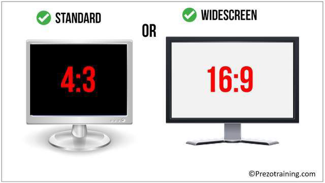
Before you start doing anything, make sure the slides are in the video format.
For example, if you add some video feature, or display your presentation on YouTube or Vimeo, ideally use the 16-by-9 ratio, which is used for filming.
– How to record videos at home
Both in PowerPoint and in Keynote just select the widescreen format option.
Using slides in the same video format ensures that no information is clipped and makes editing easier.
Your presentation will adjust to the proportion of the multimedia projector or screen, when it is the case of TVs, monitors, tablets, and others.
Text
First basic rule for texts in professional presentations: keep them short and go straight to the point.
Do not use long paragraphs, full of explanation. This will leave your stuff heavy and dull.
Instead, use bullets or short phrases. You can even use multiple slides to explain a single point, which is better than trying to squeeze everything into one.
Your audience will thank you and your presentation will be much more enjoyable.
Colors
Now, let’s dive into the color choice for your slides, your brand and even your sales page.
If you already have a brand, use its colors in the presentation. Your course is a direct extension of you and your brand, and the slides should keep that same identity.
So when the audience sees your course, it knows it’s yours because it recognizes that pattern.
If you do not have a brand or an already chosen color palette, no problem.
Select two to three colors to use on all slides. Choose a dark and a clear color because they stand out best when used together.
Then choose a third complementary color to use when you want to emphasize something.

Keep in mind readability, how colors blend, and whether they work well together.
If you do not take care of that aspect, your presentation can become a real carnival, tiring to the eyes.
To help you choose colors that work well together, here are three great websites that you can use:
- Color Lovers: Great option to generate color palettes, especially if you’re new to the subject. In this site you can search for colors by keyword, hexadecimal code and even by the most recent creations that brands are using.
- Coolors: One of the favorites, Coolors is super easy to use. All you need to do to generate color combinations is to press the spacebar. That’s right, just click on the space bar and a new palette will appear each time. The site also provides a search section where you can search for Color Palettes already assembled.
- Adobe Color: This Adobe site allows the creation of palettes through a Color Wheel that can be adjusted in several ways, such as Triad, Complementary Colors and Monochrome. In Adobe you can also explore palettes created by other users.
The colors you choose can be used as solid background colors or in other elements of the layout along the slides.
For text, you can use one of the colors selected in the header or when you want to emphasize an important word.
You can also apply another color to body text, but generally use black or dark gray or white, depending on the background color, is the best option.
Aside from being the most common, it’s actually the most readable way. So our tip is that you stick with the default colors for the text and use your palette in other ways.
If you lack inspiration, go to SlideShare and see what others are doing.
It is not necessary to invent the wheel, if someone did something cool, adapt the idea to your color palette and replicate.
Typography
Now let’s get some typography tips and how to choose the best fonts for professional presentations.
First, you must decide between a serif font or sans serif for your text.
Remember that the font with serif is the one with small traces at the end of the letters stems.
Many people say that serif fonts create a sense of continuity, making it easier to read.
On the other hand, here at Coursify.me we like most of the non-serif fonts, which have a more casual and friendly look (but no Comic Sans!).
Combining fonts can be a daunting task, but fortunately, font designers have already created collections that work well together.
The trick is to choose variations within the same family, such as Helvetica Bold Condensed and Helvetica Light.
Notice how they are different, but still maintains a visually pleasing pattern.

Avoid using decorative or script fonts because they are much harder to read, especially when they are small.
If you do not like any of the fonts that are already installed on your computer, there are sites like DaFont and FontSquirrel where you can find different and free fonts.
As with color sites, you can search for keywords and font styles, such as lettering with quotation marks, serif script, and so on.
So just download the chosen fonts and install them on your computer.
One last thing to remember is to make sure you use one that is large enough to read.
Do not go to a 20 size font. It’s too small. Start with at least 40 points. Bigger is always easier to read.
Images
As we said at the beginning of this post, the visuals draw more attention and keep your audience interested.
To make your content more attractive, visit sites like Flickr and Pixels and choose images that relate to your text.
Selection made, follow the first obvious and important tip: if the background image is dark, use the font in light color, and vice versa.
If the photo has many colors or many elements, add a shape over it, like a text box, to keep the readability of what you are going to write.

One idea that creates a cool effect is to add a solid color rectangle over the image. All you have to do is create a rectangle the size of the slide, paint it with one of your colors and position it on the photo. Then reduce the opacity until you reach the desired tone.

As you can see, this helps the slide look much more interesting, but keeps the text and colors reasonably intact.
You can also reverse this process. Instead of putting a color on the image, you can reduce the opacity of the image itself, so you can see it slightly in the background, like a watermark.
Images are great, but if you need to put other type of visual information, such as graphics, they can disrupt readability.
In this case, we advise you to use the main color of your palette on the backgorund in a solid way.
Remember that you do not need to consume every inch of space.
Professional presentations are clean and give the reader room to breathe and absorb the content.
Professional presentations for online courses
To make your online classes more interesting and improve your professional presentations, you can insert audio by explaining the content while the student accompanies the slides.
With PowerPoint you can add audio, such as songs, narration or effect phrases to your presentation.
To record and listen to any audio, your computer must be equipped with a sound card, microphone, and speakers.
Just click on the audio option and start recording. When finished, listen to everything to make the necessary adjustments.
There is even the option to insert videos that you can take advantage of, if you have some recorded video that contributes to the content, to make classes even more complete.
– Design and video editing tips
Material ready, go to the Coursify.me website and upload it to the page of your online course and ready, it will be accessible to all your students.
Perfect solution is for those looking for more privacy and a high level of viewing experience Coursify.me also allows full integration with Vimeo and YouTube.
– How to get more views for your lessons on Youtube
Serving businesses and professionals in more than 60 countries, Coursify.me is the ideal choice for anyone who wants to create, sell and promote courses on the internet without having to invest to start their own business.
Visit our website, test the platform and see how easy it is to profit by doing what you love.